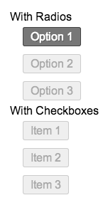
Styling inputs can be pretty annoying. I don’t think I really have any consistent way of making custom inputs. Especially when it comes to radio and checkboxes. I will always prefer using CSS instead of images for obvious reasons. But for radios and checkboxes I normally use images. I usually just make a png sprite and use the :checked selector to move its position.
But now, I have discovered a new way! I took the idea from CSS Tricks/Wufoo Forms. It basically uses the label as the element. You hide the input tag and then style the label with checked and unchecked states.

/* style this span element so we can display nicely, this styling is not necessary */
span {
margin: 10px 0;
display: block;
width: 100%;
float: left;
}
input[type="radio"],
input[type="checkbox"] {
/* hide the inputs */
opacity: 0;
}
/* style your lables/button */
input[type="radio"] + label,
input[type="checkbox"] + label {
/* keep pointer so that you get the little hand showing when you are on a button */
cursor: pointer;
/* the following are the styles */
padding: 4px 10px;
border: 1px solid #ccc;
background: #efefef;
color: #aaa;
border-radius: 3px;
text-shadow: 1px 1px 0 rgba(0,0,0,0);
}
input[type="radio"]:checked + label,
input[type="checkbox"]:checked + label{
/* style for the checked/selected state */
background: #777;
border: 1px solid #444;
text-shadow: 1px 1px 0 rgba(0,0,0,0.4);
color: white;
}
I have removed all the unnecessary styles and only put in the relevant stylings. Of course you could always use a background image that moves/changes but for this demo I just styled the labels to resemble buttons.
<span>
  <input id="Radio1" name="Radios" type="radio" value="Option 1">
  <label for="Radio1">Option 1</label>
</span>
<span>
  <input id="Check1" name="Checks" type="checkbox" value="Item 1">
  <label for="Check1">Item 1</label>
</span>
The text inside the label will be the text displayed as your button. You must have the ID and FOR attributes on the input and labels. Removing those will break the functionality. As always I have added a little jsFiddle demo into the mix.
James Doyle
I'm a full-stack developer, co-organizer of PHP Vancouver meetup, and winner of a Canadian Developer 30 under 30 award. I'm a huge Open Source advocate and contributor to a lot of projects in my community. When I am not sitting at a computer, I'm trying to perfect some other skill.